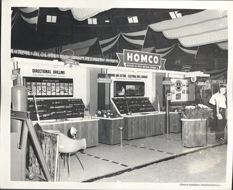
Within 55 years, exhibition stands have gone from largely dull, cluttered shopfront imitations to multi-sensory, blow-your-mind experiences.
Over the decades, trade shows and exhibition stands have continuously adapted to new technologies, design trends, and market demands.
Today, modern stands focus heavily on attendee engagement, gamification, and data-driven interactions to optimise ROI and nurture potential leads – a far cry from their humble beginnings.
The Evolution of Exhibition Stands

1960s
Heavily reliant on print advertising, focusing on product showcases and facilitating immediate sales orders.
Shell cladding was invented in 1968.


1970s
Modular, lightweight systems replaced heavier wooden structures, making stands easier to assemble, transport, and customise.
Strategic lighting created eye-catching product showcases.


1980s
Growing competition fueled innovation in how stands were designed and how exhibitors engaged with audiences.


1990s
Experience and storytelling grew in importance, highlighting brand missions, values, and unique selling points within stand design.


2000s
Companies built stands to reflect a consistent brand story, with large-scale graphics, improved lighting, and modular builds.


2010s


2020s
As live events resumed, a renewed focus emerged on maximising attendee engagement and capturing actionable data.
Stand engagement and data collection through digital interactions have become crucial for exhibitors aiming to enhance ROI and nurture better lead prospects. Gamification, interactive tools, and real-time analytics define the modern trade show experience.

Key Components of the Modern Exhibition Stand Experience
Rethinking Stand Design
From the evolution timeline, it’s clear to see that stand design can quickly become dated. Companies must be adaptable with their design to stay ahead of the curve and remain on trend.
- Smaller footprints with bigger impact: Many exhibitors focus on fewer but more immersive displays, ensuring every square metre captures visitor’s attention. Many companies trust an exhibition stand design and build company for their wealth of knowledge and experience to ensure maximum impact for their investment.
- Sustainable advantage: A unique 80/20 bespoke hire formula allows exhibitors to hire 80% of their stand architecture blended with 20% custom brand elements, encouraging environmental initiatives, stand reusability across upcoming events, and freeing up more exhibiting investment for custom engagement tools.
Enhanced Stand Engagement
As technology evolves, so do the exhibition engagement possibilities. Keeping up with these advancements is a sure way to stay ahead of the competition and keep visitors engaged with your brand. For a seamless blend of physical and digital interactions, consider integrating ‘phygital‘ solutions that elevate experiences beyond traditional stand design:
- Gamification: Exhibition stand games transform passive passersby into active participants through fun, interactive challenges, while multiplayer stand games foster friendly competition that sparks conversation and draws crowds.
- Immersive Experiences: Augmented Reality (AR) brings digital overlays to physical booths for immersive product demos, while Virtual Reality (VR) transports attendees into fully interactive environments that leave a lasting impression.
- Transform Traditional Engagement: Quizzes let visitors test their knowledge or learn more about your products, and stand surveys quickly capture insights to guide post-event follow-ups.
- Event apps and interactive signage: QR codes and NFC tags offer a contactless way to learn about products, sign up for newsletters, and enter prize draws.
Data Collection and ROI-Focused Strategies
Exhibitions can be a large investment therefore it becomes imperative to refine every aspect of an event experience to boost ROI.
- Digital lead capture: Many modern stands use tablets, smart kiosks, or scanning apps to record attendee interactions. Companies like Nimlok specialise in engagement services that integrate interactive elements with data collection, enabling exhibitors to refine follow-up strategies.
- Real-time analytics: With state-of-the-art exhibition stand analytics, exhibitors can track footfall, dwell time, and engagement levels at specific displays using heatmaps and passive mobile signals. By analysing this data, exhibitors can calculate their event ROI more accurately and improve their stand experience at the next event.
- Staff training: no matter the future of exhibition stands, human interaction will be at the heart of turning a good experience into a great one. Investing in exhibition stand staff training ensures staff are representing the company in the best light and leaving a lasting impression on visitors.
From Simple Booths to High-Tech Engagement Hubs
The evolution of exhibitions demonstrates that trade shows and exhibition stands are far from static. They’ve progressed from utilitarian setups focused on product displays to immersive, tech-driven experiences that use gamification, interactive tools, and data analytics to generate real ROI.
Understanding how exhibitions have changed over time not only informs us of the historical journey but also highlights the strategies necessary to succeed in today’s environment as well as that of the future. With recent technological advances in AI and robotics, we are certain that exhibitions will continue to evolve rapidly.
Long gone is the mindset of “This always used to work so let’s keep doing it”. (We’re looking at you, the business card fishbowl!) Embrace innovative design and the newest engagement services to enhance the brand experience.
Stretch your budget and reap the rewards. Explore Nimlok’s services that help bridge creativity with cutting-edge technology to create tailored, immersive stand designs.
Frequently Asked Questions
What are the most significant changes in exhibition stand design over time?
The shift from simple, wooden booths to modular, tech-integrated stands with a heavy focus on sustainability and engagement.
Which sustainable materials are commonly used in modern exhibitions?
Reusable aluminium frames, LED lighting, recycled flooring, and minimal or digital-only print collateral.
How do engagement games boost ROI?
Interactive games and quizzes draw attendees in, encourage more dwell time at the booth, and provide valuable data for follow-up marketing.
Is social media still relevant for trade shows?
Absolutely. Sharing live updates, photos, and behind-the-scenes content via platforms like Instagram, LinkedIn, and TikTok can greatly expand your event reach.
